01 The users
A checkout that looks like theirs, without building one
Smaller merchants embed a hosted cashier because they do not have the people to build their own checkout. What they want is for it to look like theirs — their colours, their type, their logo — without a development project to get there.
That is what theming is for. The merchant gets a branded checkout without building one.
02 The problem
Two kinds of merchant, one cashier
The platform's merchants come from two activities: e-commerce and gaming. Each wanted the deposit flow to look like the rest of their own site, and one merchant could run several brands, each needing a look of its own. What they asked for was their colour schemes and their own fonts.
So the cashier had to stay one product and look like several: separate themes for each activity, and controls each brand could set for itself.
03 The limit
What a merchant can safely be given
Give merchants a colour picker and one will eventually choose a combination that fails. I found a button whose background could be set to white while its label stayed white: a control that renders itself invisible, and does it silently.
The constraints are not about keeping the product tidy — they protect the merchant's own conversion rate, on the screen where their customers pay.
04 The decision
A scale, not a text field
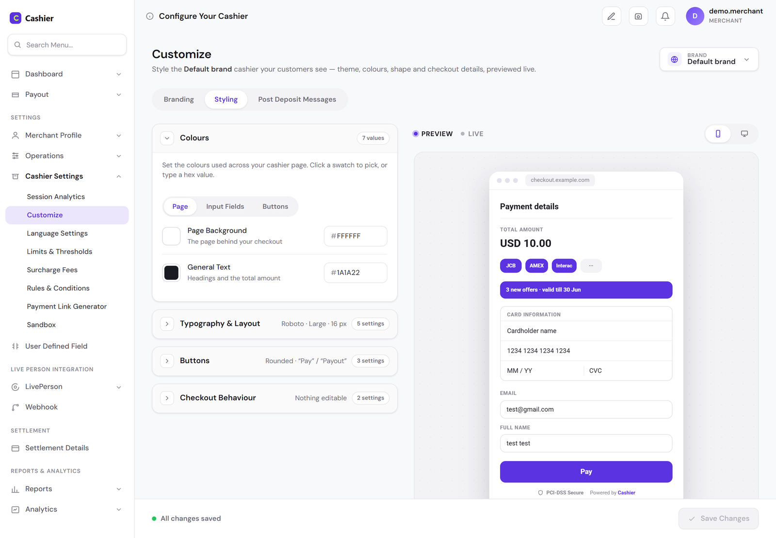
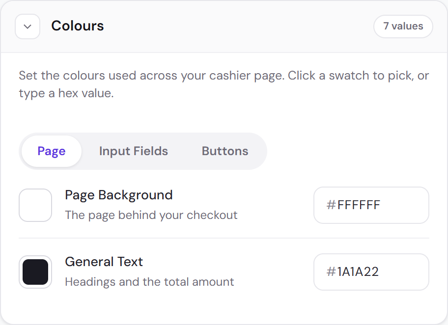
Seven colours, each named for what a customer sees.
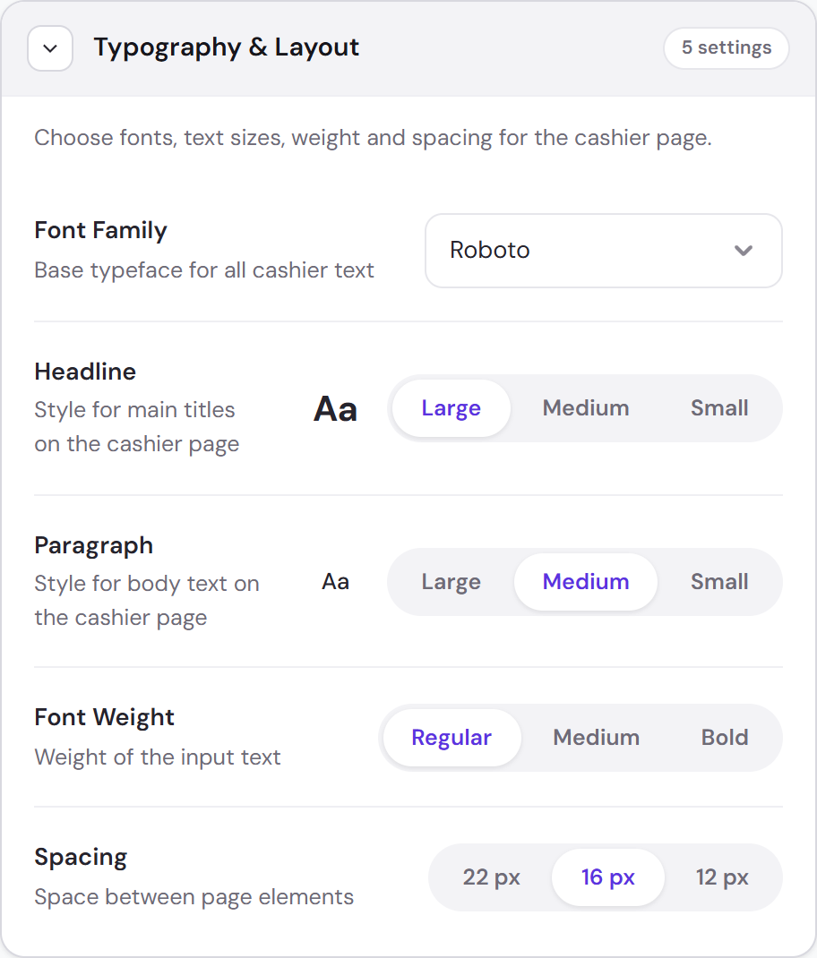
Typography is a scale. The merchants asked for their own fonts; they got four to choose from. A merchant cannot type 7px, and cannot bring their own font.
No interaction states at all. A merchant knows what their brand looks like. They do not know what an error state has to do. Hover, focus and error are derived, not configured.
Every section says what it is currently set to — “0 of 2 set” on the logo and favicon, “Roboto · Large · 16 px” on typography, “Nothing editable” on checkout behaviour — so a merchant can read the whole configuration without opening a single section.
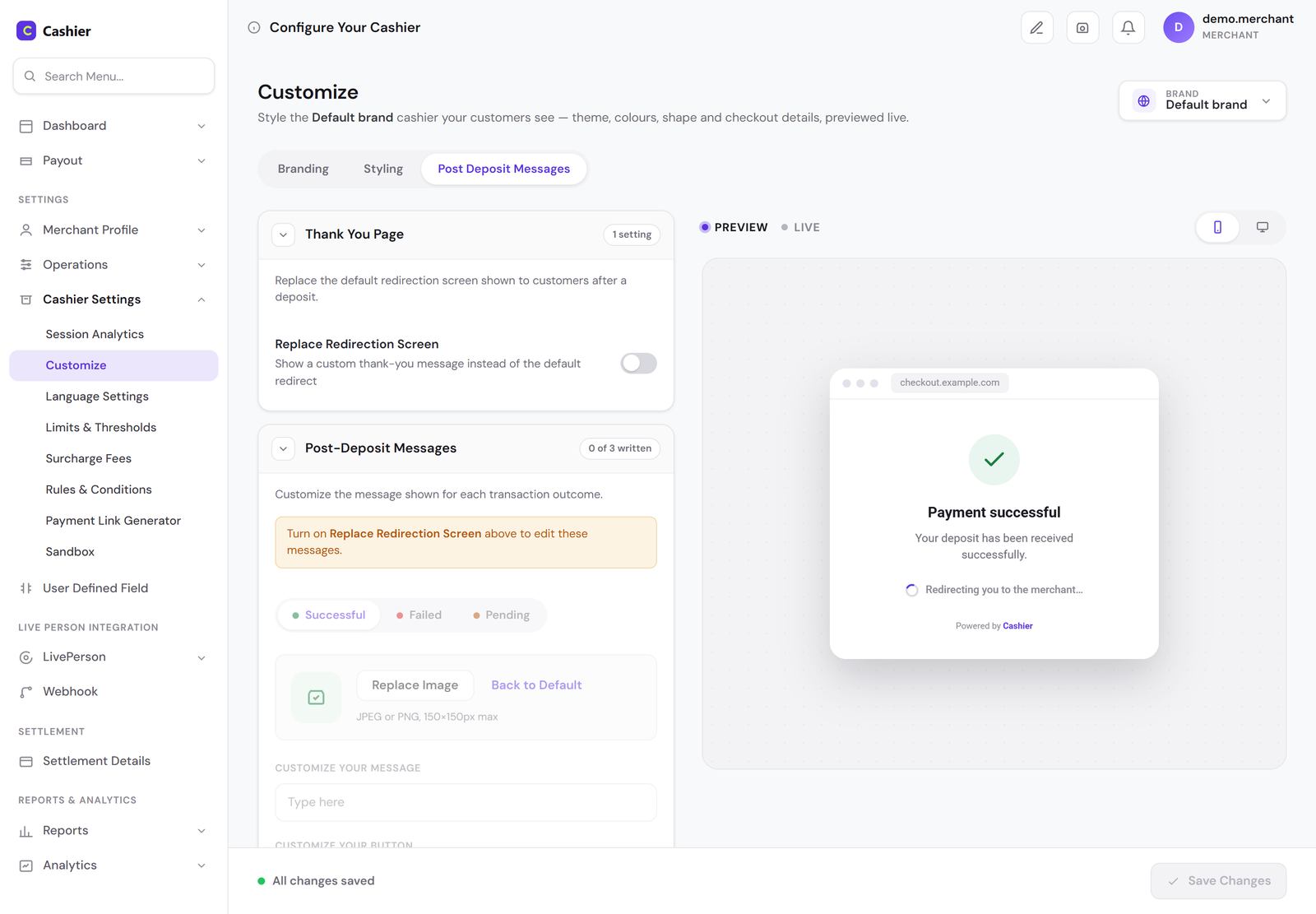
One pair still needed a guard. Button text and button background are both editable and sit in the same group, so the white-on-white case can still be built. The shipped product warns the merchant when that pair fails contrast, rather than taking the choice away.
05 Where it got hard
The stepper on a phone
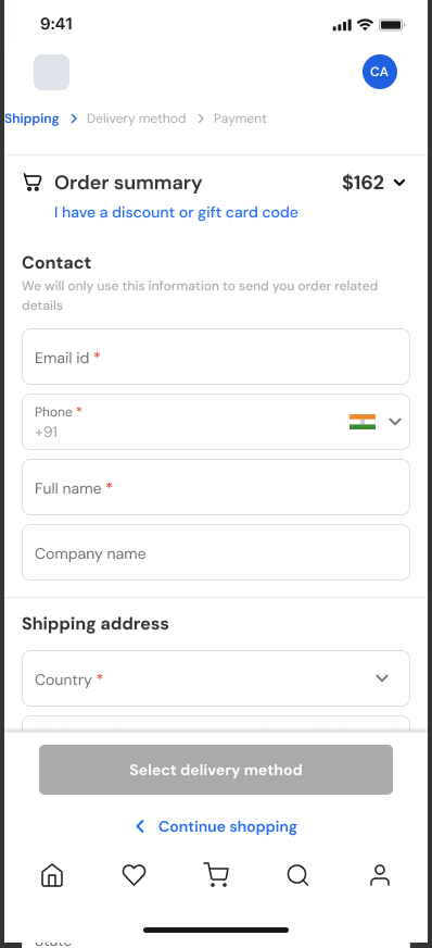
The checkout step counter sits in the header. Styling applied to the desktop header carries to mobile, where the header is also where the steps live — so a merchant choosing a white step counter and a blue header makes the steps invisible on the device most customers pay from.
I rejected moving the counter inline with the logo for two reasons: the steps are tap targets and the space does not allow a comfortable one, and a horizontal logo — the kind plenty of merchants have — leaves no room beside it at all. On a phone the steps get a row of their own, under the logo.
06 The themes
Two activities, separate themes
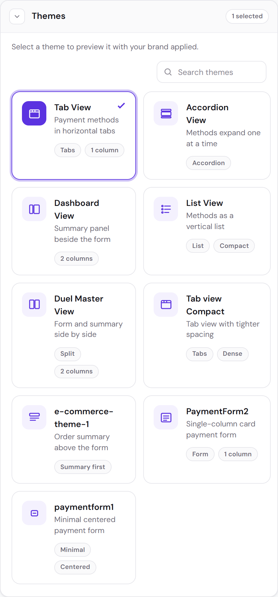
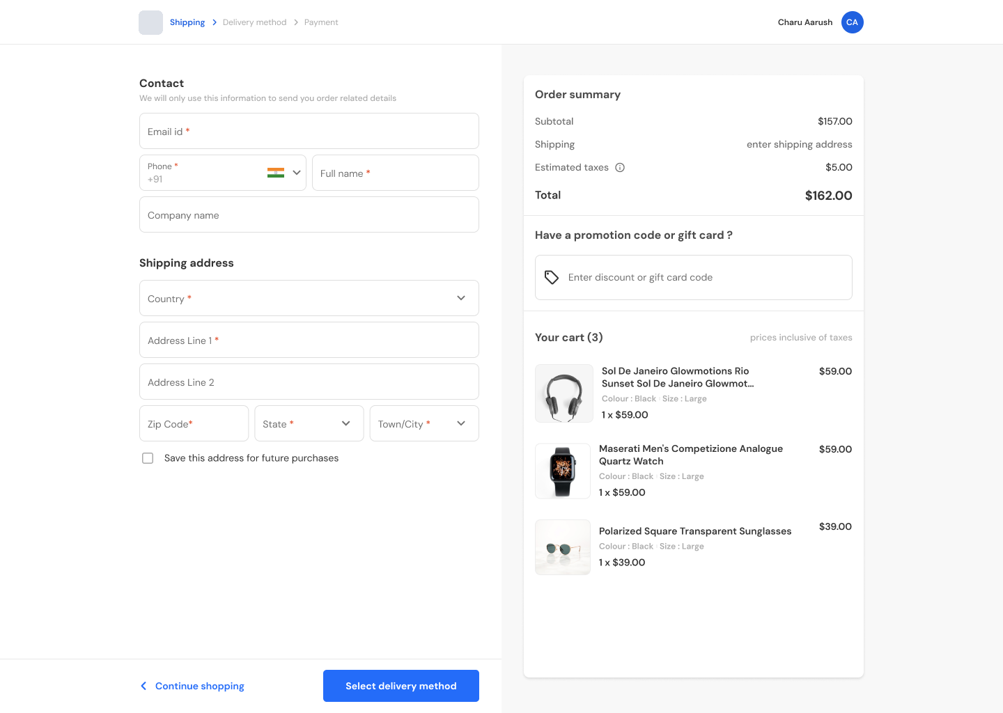
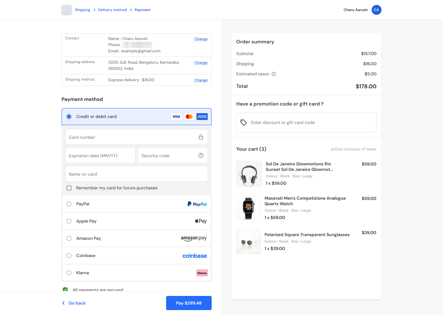
Gaming and e-commerce customers expect different checkouts. A deposit is not a purchase: there is no cart, no shipping, no delivery method. So each activity was offered its own themes, and I designed the e-commerce one — desktop and mobile, for new, returning and guest customers.
07 Where it stands
Shipped, for both activities
The themes and the customisation controls have shipped, with no serious disagreement and no reversal along the way.
I think that is because the limits came first. Seven named colours, a type scale and no interaction states were decided before the controls were drawn, so the arguments a customisation page usually produces — whether a merchant can set this, at what size, in which state — were settled in the design rather than discovered in the build.
08 Reflection
What I learned
-
Customisation is a safety question before it's a brand one
Deciding what could not change came first; the brand was built from what was left.
-
Name a control for what the customer sees
“Input field border” needs no help text.
-
A setting reaches further than the screen it was designed on
Every customisation has to be checked on every breakpoint it reaches, not only the one it was drawn for.