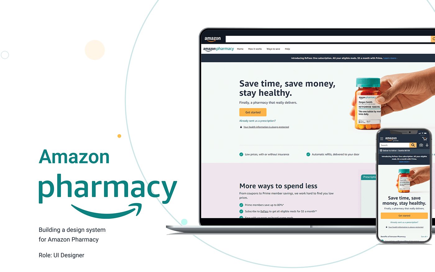
01 The problem
Two weeks of work that happened every time
An event page took around two weeks and 56 separate graphics.
The two weeks went to three things, and no single one of them was the problem. Every graphic was produced by hand. Each one went through an approval cycle. And the page passed between teams on its way to being built, so the waiting was structural rather than anyone’s fault.
The cost wasn’t only the two weeks. It was that the stakeholder teams — the people who owned the events — couldn’t build anything themselves. Each page had to come through design, so each page waited.
02 The pilot
A tool that wasn’t ready for the pages it was meant to build
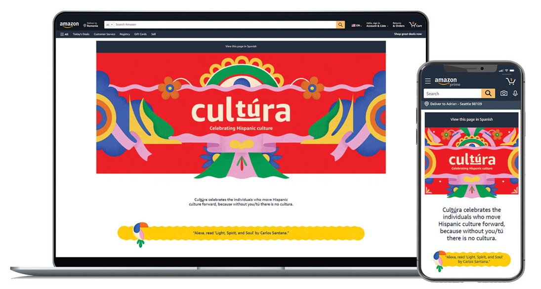
I was asked to pilot a new internal page-building tool on two US cultural events, one of them Hispanic Heritage Month.
It was missing two things an event page could not do without.
It couldn’t build carousels. An event page has a lot on it — small business owners, their stores, curated content, promotions — and without a way to group things horizontally, all of it goes in a single column. On a phone that is a very long scroll, and most of the page is below the point where people stop.
It couldn’t do typography outside the standard set. A cultural event page has to look like that event and not like every other page in the store, and type is most of how it does that. But custom type is also where accessibility breaks: a typeface chosen for character, at display sizes, over photography, is exactly the case contrast requirements exist for.
So the second one was not a request for a font. It was a request for a font and the means to prove it still passed.
03 Extending it
The fix was in the tool, not around it
The quick route was to build the page the old way and report that the tool wasn’t ready. That would have delivered the page and left the problem exactly where it was.
I specified what was missing and worked with a design technologist to extend the tool, so the capability existed for every page after this one rather than only for mine.
04 The page
Nine business owners, read on a phone
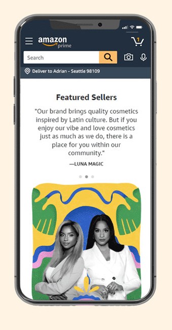
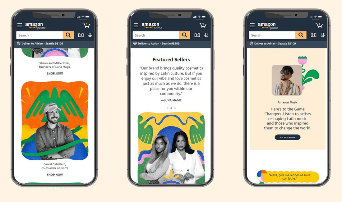
The page itself was about people: nine Hispanic small business owners, each with a link to their brand store, alongside a Hispanic storefront and other curated content.
That is a lot for one page, and it had to work on a phone. The risk was the one from section 02 — everything in a single column, and most of it below the point where people stop.
So the wireframes started on mobile, with the Featured Sellers quotes, Explore Categories and Cultura Stories.
05 Accessibility
The typography I asked for is the typography I had to prove
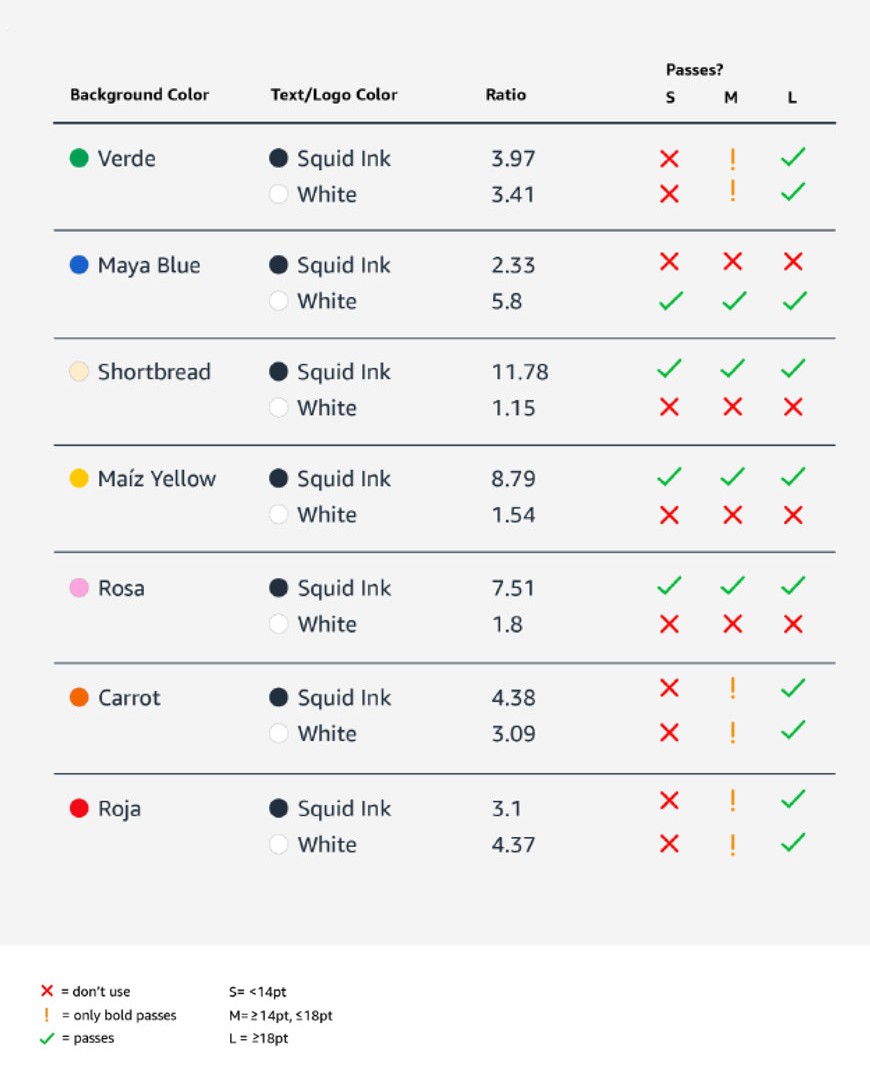
The custom typography is the reason this testing existed. Having asked for type outside the standard set, checking every background against both text colours at three sizes was the cost of the request, not a separate exercise.
Throughout the design process, I paid special attention to ensure that all visuals and text elements met the level of colour contrast for both normal text and large text.
06 The handover
I stayed available. They stopped having to wait for me.
The work wasn’t finished when the page shipped.
I wrote the workflow down, and then taught it live, step by step, to both stakeholder teams. Documentation on its own would not have done it — a written process is read by someone who already knows what they are looking at, and these teams had never built a page before.
I stayed available afterwards for the questions that only come up once someone is doing the work themselves.
But an event page now took them about a week of their own effort instead of three, and nothing had to come through design before it could start. Being available and being a bottleneck are not the same thing, and the second one was what had to go.
07 Reflection
What I learned
-
The deliverable and the work are not always the same thing
The page was what I was asked for. The reason it mattered was that the pages after it didn’t have to wait for me.
-
A tool that isn’t ready is a brief, not an obstacle
Building the page the old way would have shipped on time and changed nothing. Specifying what was missing cost more and was the actual job.
-
Handing work over is a design task
Documenting the workflow and training two teams was not administration after the design. It was the part that turned one page into a way of working.